Background
FoodRazor is a software that helps restaurant automates the ordering to suppliers, extracts data from invoices and provide personalised analytics to monitor food costs. The build of the first version of the webapp was not able to handle the increasing usage load and the addition of numerous new features had caused many technical debts and impends it's performances.
The navigation flow was restricting users to a forced user path that does not orientate well with newly signed-up users. The inappropriate user interface components also reduced the user-friendliness of FoodRazor's Eatery app. The current long list of accordian menus took up too much time to load and had caused severe performance lag that prevent the users from completing their tasks efficiently.
My Role
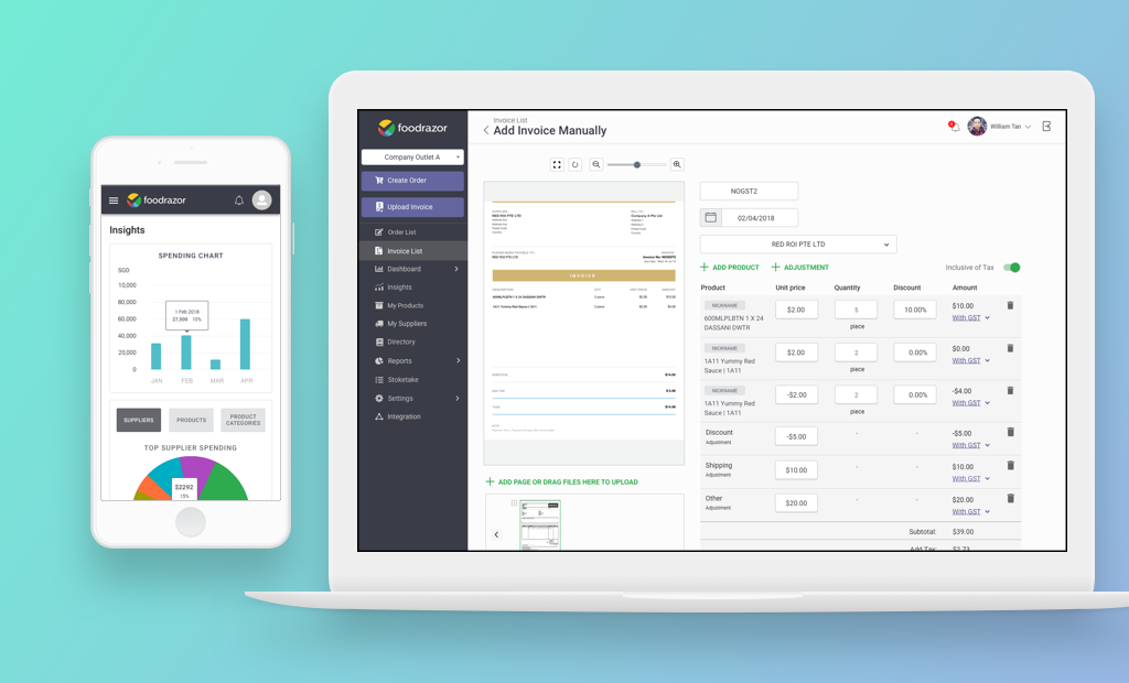
I was recruited as a UX/UI Designer to work along side the newly formed product team, consisting of the tech lead and product owner to revamp the user interface of FoodRazor's Eatery desktop and mobile app.
Problems Discovery
Define the right problems to solve
The product team and I reviewed through the product development backlogs and feature requests on Trello. We scope out the key areas to work on based on how critical it may impact the users' ability to complete their key food precurement operations. The team mapped out a sequential product release roadmap, V2, to be launched to stablize the key core functions first.
Design Outcomes
- Based on learnings from past usage and feedback, the whole application is rebuilt with more scalability and the userflow of the primary core features are streamlined and made simplier to use.
- I co-sketch and chart out the user taskflows of various modules, such as Sign-Up, Create New Order and Invoice, Integrations and Settings with the product team.
- The cumbersome accordian interface was replaced with clear table layouts that consolidates and display various invoice and order status clearly to the users, allowing them to act on their precurement approvals more efficiently.
- Clarity of the invoice and order information was a top design consideration. Important status text labels and help tooltips are incoporated to provide clearer wayfinding for navigating the core features.
- The layout of Dashboard, Insights and other core sections was also optimised for responsive mobile view to cater to restaurant crews that required to use the application on the go.
- Design mockups on Invisionapp was used to test and gather feedback internally from Sales and Customer Success team to gauge, iterate and refine the re-vamped dashboard design.

Mockup of re-designed FoodRazor Eatery Dashboard V.2